Top 12 Ugliest Rugby Shirts Ever, Including England & Leicester Tigers
Rugby NewsMonday, 25 February 2019 at 16:59
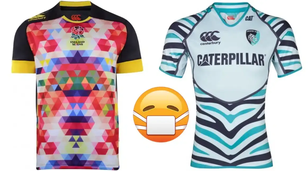

When rugby fashion goes seriously wrong.
12. Newcastle Falcons - Away (2017/18)
The jersey, designed by ISC who are known more for their rugby league kits, does look like a rejected Wigan Warriors away shirt.

11.Calvisano – Home (2006/07)
Although the actual shirt itself isn’t too horrendous, the lengths gone to in order to accommodate seemingly every sponsor going make this pretty awful to look at.

10. Edinburgh – Third (2009/10)
Not only is this shirt visually offensive, but it seems to be trying a bit too hard. The designers have obviously tried to design a controversial shirt that will receive press coverage for the club, and maybe boost attendance at Edinburgh games.

Edinburgh's Phil Godman and Nick de Luca with the loudest kit in rugby!!?
9. Leicester Tigers – Away (2012/13)
The Tigers are a team with a proud history, hailing from rugby’s historic heartlands in the East Midlands. Their shirts reflect this, usually opting for hooped shirt designs of some sort, using their club colours of green, red and white. In recent years however , with clubs relying on shirt sales to boost their ever increasing budgets, shirt designers have been tasked with making clubs’ shirts noticeably different each year, in order to encourage people to buy the latest shirt. This one was a major fail.

8. England Sevens – Alternate (2013/14)
The second rugby sevens shirt in this countdown, which could if truth be told, have been entirely populated by sevens shirts. We tried to keep the majority of the list populated by shirts from the more well-known fifteen man code, but I just could not write a countdown of ugly rugby shirts without including this psychedelic nightmare.

7. Austria
Supporters of Austrian rugby - yes there is such a thing apparently - came up with a jersey design that included boring brown braces.

6.Perpignan – Third (2010/11)
Perpignan's attemped checkers design could have looked classy, but ended up looking more like the class clown with their jester-inspired design.

5.Blue Bulls – Away (2014)
The only situations where camouflage is acceptable as clothing, is if you are actually in the armed forces, you are playing paintball, or you are at a rave in the early ‘90s.

4. Ospreys – Training (2011)
This is a training shirt, and as such, was worn for training sessions, and pre-match warm-ups. However, as it was worn on the pitch by Ospreys players, in front of fee-paying fans, and sold to unwitting supporters, I do feel that its inclusion is justified.

3. Melbourne Rebels - 2014
Granted it's celebrating their indigenous culture but the design, while eye-catching, is hardly aesthetically pleasing.

2.Canada – Away (1995)
While the 1995 Rugby World Cup may be remembered for being the first major sporting event to be held in South Africa since the end of apartheid, for Canadians of a certain age, it will be remembered because their embarrassment at not scoring a single point against the hosts during their group game, was increased exponentially by the fact that they had to play wearing this monstrosity.

1. Stade Francais – Third (2011/12)
The number one spot goes to this monumental affront to taste and decency from Parisian powerhouses, Stade Francais. Anyone who is familiar with European rugby will not be surprised that it is a Stade Francais shirt that has topped this chart. In fact, if we had not restricted myself to only one shirt from any club or nation, Stade Francais would probably have dominated the entire top ten.

TRENDING

LATEST NEWS



LATEST COMMENTS
Loading